

Time Entry Mobile App
Role: Product Designer
Tasks include: Researching users, Planning user tasks and flows, Creating wireframes and prototypes, Testing usability, and Designing user interfaces
Timeline: 4 Weeks
Tools: Figma, UserTesting.com
Collaborators: Engineers, Product Manager
Project Overview
The existing mobile time entry experience was outdated, lacked support for international formats, and was cumbersome for users. My objective was to redesign the app to be intuitive, efficient, and adaptable, aiming to shift 50% of users from desktop to mobile.
The problem
Challenges Identified:
Users faced challenges with the outdated mobile interface, including difficulties with international time formats and a high-friction UI for entering, editing, and submitting time. Project approvers also needed a more efficient way to review and approve submissions.
In numbers
Success would be 50% of customers using the mobile app instead of relying on the desktop experience. Also, a simple, low-friction customizable app that allows users to capture time with detailed progress.
Key Features & Design Decisions:
Intuitive Time Entry Workflow
Simple input fields that adjust based on user preferences (e.g., 24-hour vs. 12-hour formats).
Pre-filled suggestions for common time entries, reducing manual input.
Quick-edit mode to modify time entries with minimal taps.
Approvals & Feedback Made Easy
Card-based layout for quick scanning of submitted entries.
Inline commenting feature allowing Approvers to provide feedback before approval.
One-tap approval action, reducing the time spent managing entries.
Customizable & Inclusive Design
Localization support for international time entry formats.
Dark mode & accessibility considerations for diverse user needs.
Offline support to allow users to enter time even without internet access.
Process & Collaboration
1. Research & User Insights
Conducted user interviews to understand the pain points of both employees and Approvers.
Used UserTesting.com to gather feedback on early wireframes and iterate accordingly.
3. Testing & Iteration
Ran remote usability tests on UserTesting.com, identifying friction points.
Iterated based on feedback to enhance usability, reducing steps required to enter time by 30%.
The goal
The Design Story
To address these challenges, I implemented an intuitive time entry workflow with customizable input fields, pre-filled suggestions, and a quick-edit mode. For approvers, I introduced a card-based layout with inline commenting and one-tap approval actions. The design also includes localization support, dark mode, and offline capabilities to cater to diverse user needs.
2. Wireframing & Prototyping
Created low-fidelity sketches to validate the core workflow.
Developed interactive high-fidelity prototypes in Figma for usability testing.
4. Handoff & Implementation Support
Provided detailed design specs and prototypes for engineers.
Maintained ongoing collaboration during development to refine interactions and edge cases.
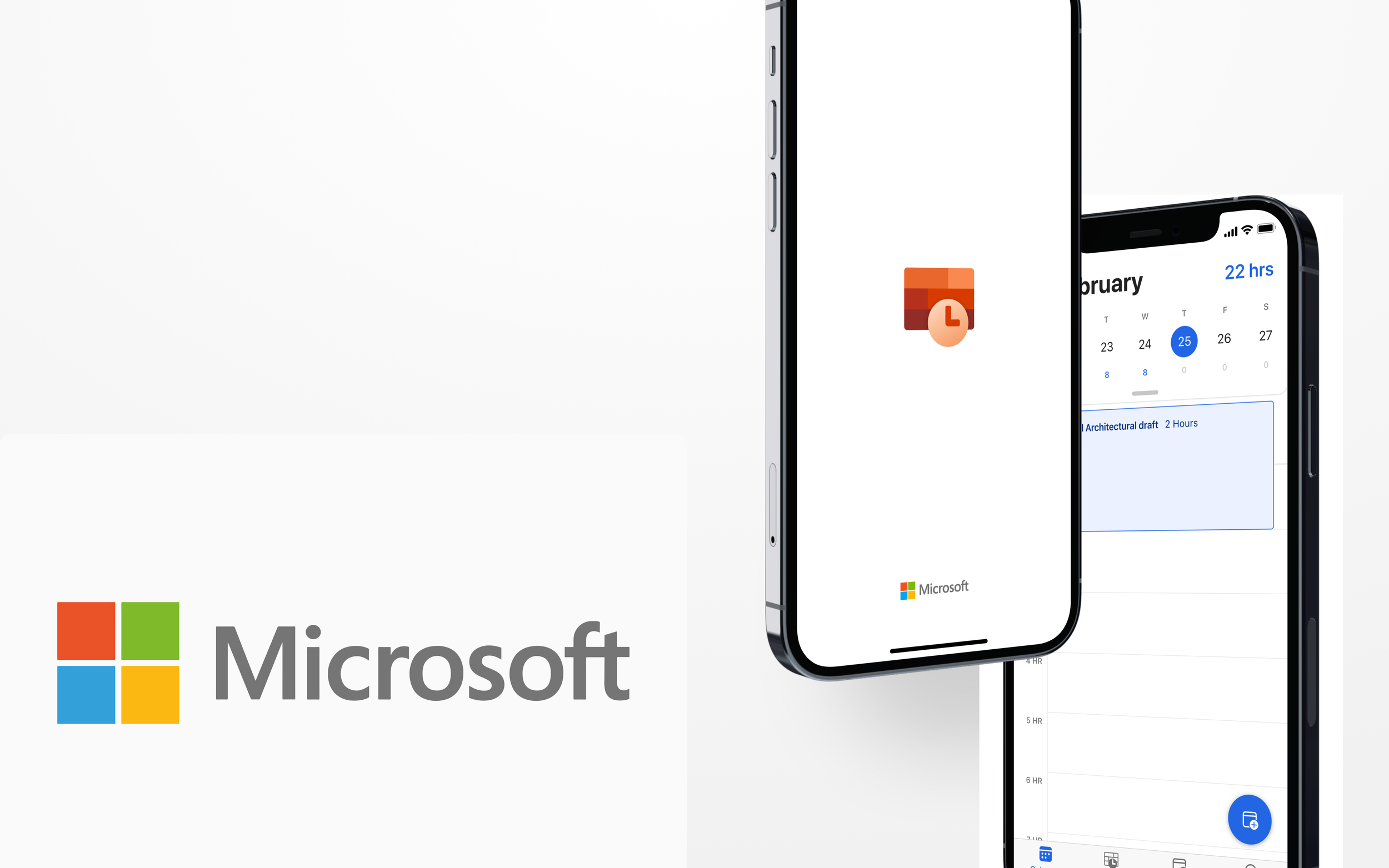
Design approach and prototype


The prototype
The design decisions
Design Justification Using UX Principles
Jakob’s Law: The UI follows familiar patterns from leading time-tracking tools, reducing the learning curve.
Hick’s Law: Simplified decision-making by providing only the essential options upfront while keeping advanced settings accessible.
Fitts’ Law: Primary actions (Submit, Approve) are designed for quick access, reducing effort.

Outcome & Impact
✅ Improved usability, making time entry and approvals significantly faster.
✅ Reduced friction, leading to a higher adoption rate among international users.
✅ Increased efficiency, with users completing time entry 30% faster than before.
✅ Aligned mobile experience with modern UI expectations, boosting engagement.
Reflection & Learnings
User testing early & often is key: Gathering insights at multiple stages led to a more user-centric final design.
Localization matters: Addressing international time formats increased global usability.
Designing for speed & efficiency: Reducing taps and simplifying workflows improved adoption and satisfaction.
This project reinforced my belief that great design isn't just about aesthetics—it’s about making essential tasks effortless.